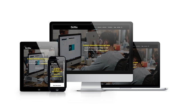
What is RWD and why I should have it?

Responsive Web Design or short RWD is mobile responsive design. The mobile responsive design is responsible for displaying your site perfectly on all devices like smartphones, tablets, laptops, and desktop computers. The latest statistics show that about 70% of all online visits are coming from mobile devices. Therefore, if you are not utilizing a mobile responsive design, it means you are losing a lot of traffic.

Share on facebook
Facebook
Share on google
Google+
Share on twitter
Twitter
Share on linkedin
LinkedIn
Share on pinterest
Pinterest

Your Privacy

Strictly Necessary Cookies

Functional Cookies

Targeting Cookies

More Info

Privacy Preference Centre

×

Your Privacy

When you visit any web site, it may store or retrieve information on your browser, mostly in the form of cookies. This information might be about you, your preferences or your device and is mostly used to make the site work as you expect it to. The information does not usually directly identify you, but it can give you a more personalised web experience. Because we respect your right to privacy, you can choose not to allow some types of cookies. Click on the different category headings to find out more and change our default settings. However, blocking some types of cookies may impact your experience of the site and the services we are able to offer.

Button/s disabled in cookie pref. center.

To make it functional again,

you need to:

1. Enable it,

2. Refresh the page.

cookies settings